
Why Choose the Grishko Collection
Defining modern comfort and timeless style—crafted for every occasion, tailored for every body


Mar 24
Mar 26 - Mar 30
Apr 02 - Apr 07


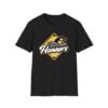
Few designs manage to bridge the gap between local sports pride and global streetwear trends, but the 2026 Wichita Honkers Shirt has done exactly that. Exploding onto the scene this January, the “Honkers” graphic has become a shorthand for resilience, attitude, and a touch of humor.
The visual appeal of the shirt lies in its masterful use of contrast and aggressive styling. The centerpiece is the “Honker”—a stylized Canada Goose with a fierce expression, emerging from a classic yellow baseball diamond. The design utilizes a distressed, vintage filter on the yellow background, giving it a gritty, “worn-in” aesthetic that appeals to modern streetwear sensibilities.
The typography is equally crucial to the look. The word “Wichita” is rendered in a fluid, classic script, contrasting sharply with the bold, thick-bordered lettering of “Honkers.” This juxtaposition of elegant script and heavy block text creates a dynamic visual hierarchy that draws the eye immediately to the center of the chest. The stark black canvas of the shirt serves as the perfect negative space, making the yellow and white logo pop with incredible vibrancy.

This shirt means opting for a conversation starter. In a sea of generic branding, the Wichita Honkers graphic offers personality. It speaks to a specific sense of humor and a relaxed, confident style. The design is versatile enough to anchor a casual outfit—pairing effortlessly with denim, cargo pants, or activewear—while being bold enough to stand alone as a statement piece.
Furthermore, owning the 2026 edition locks you into a specific cultural timeframe. As trends cycle, this specific graphic, with its unique mascot orientation and typography, will serve as a time capsule of the current year’s style zeitgeist. It is an accessible way to participate in a massive cultural inside joke while looking effortlessly cool.
Kindly review your personalized details attentively, as numerous orders have arrived incomplete. Note that we exclusively dispatch to valid street addresses.
Grishko collaborates with reputable shipping partners, including UPS, USPS, DHL, and Yun Express, Yanwen.
Within the U.S., shipping is priced at 5.99 USD.
International shipping rates start from 13 USD.
We offer global delivery services.
US Regions:
| Item | Handling time (Mon-Fri) | Shipping time ( Mon-Fri ) |
| Apparel | 1-3 days | 3 -7 days |
| Mug | 2-3 days | 3-7 days |
| Poster, Canvas | 1-3 days | 3 -7 days |
| Hats | 2-3 days | 6-8 days |
| Bedding | 3-5 days | 7-10 days |
| 3D Clothing, Hawaiian shirt… | 3-5 days | 8-12 days |
Other Countries:
Handling time (Mon-Fri): 3-5 days
Shipping time ( Mon-Fri ): 15-25 days.
Note: Please be advised that shipping times may be influenced by public holidays, destination countries, and courier services.
Delivered
Total delivery time= Handling time + Shipping time
Although we provide estimated shipping times, it’s prudent not to plan your delivery too close to your deadline as unforeseen delays, beyond our control, may occur. Please allow extra time to accommodate such circumstances. While we strive to ensure timely delivery, we cannot be held liable for delays caused by external factors like shipping carriers, weather, holidays, customs clearance, or inaccurate delivery information.
If you encounter any issues with your order or need to make adjustments, feel free to reach out to us at [email protected]. Our team is dedicated to assisting you and resolving any concerns you may have.
Regarding multiple shipping addresses, we regret to inform you that we do not currently support this feature. If you require items to be delivered to different addresses, we kindly ask you to place separate orders for each destination.
Shipping is available to P.O. Box addresses; however, we are currently unable to deliver to military APO/FPO locations.
Regarding VAT taxes, please note that international shipments from the US are sent DDU (Delivered Duty Unpaid), and we do not collect VAT at the time of purchase. The recipient is responsible for any applicable taxes, duties, or customs fees upon receiving the package. Local customs or VAT charges may apply, and we recommend contacting your customs office for further details on your country’s policies.
USA Shipping: Flat rate $5.99 for all orders.
International Shipping: Starting from $13.00 (calculated at checkout).
Yes. Grishko.com is an independent store with on-demand production. Simply select your style, add to cart, and checkout.
Check the Size Chart on the product page for exact measurements.
Yes, but you must act fast. We allow a 6-hour window after ordering for any changes or cancellations.
Defining modern comfort and timeless style—crafted for every occasion, tailored for every body
Premium fabrics: Polyester, Spandex, or Cotton (product-specific). Engineered with reinforced stitching and advanced DTG technology for a durable
Sizes for every body: From XS to 5XL, tailored for your perfect fit.
For a lifetime of wear: Machine wash cold. Tumble dry low
Crafted for endurance: High-density fabrics designed to maintain shape and color vibrancy, ensuring a fresh look that stands the test of time.
 2026 Wichita Honkers Shirt
| 5 star | 83% | |
| 4 star | 17% | |
| 3 star | 0% | |
| 2 star | 0% | |
| 1 star | 0% |


Got it Today!!!
Very nice shirt..very quick shipping